top of page
Credits
Cosmic Diner Food Truck
Branding & Food Truck Design
GRAPHIC DESIGNER: Jason Dillon
This project looked to create a food truck branding that is a cohesive, fun experience with retro branding and unique foods. Leveraging the concept of molecular gastronomy, COSMIC DINER is a 50’s themed truck with “space-age” versions of classic diner foods which will excite customers and keep them coming back for more.

Branding Suite
The logo references vintage, hand-painted lettering with a modified version of the font Coffee Service and the tagline “Known ‘Round The Galaxy,” referencing the space theme of the truck. The rings around it also reference orbiting planets or UFOs, and it's topped off with a signature star over the “i” that becomes sort of a second mark for the brand.
The negative version of the logo is meant to look like a spaceship and combines the shape of the logo with another common retro shape frame.
The colors were chosen specifically for this brand to create a retro feeling that did not feel too kitschy or stereotypical with the names Vanilla Bean, Eclipse, Cherry Cola, Aurora Teal, and Creamsicle, which relate to either retro treats or space. While they are very bright, they are able to make the truck and other branded elements stand out without being too jarring to the eye.
Food Truck Design & More
The main event of this project was definitely the design of the truck. I used the most prominent colors from the palette and added them with a wrap that covered all the truck's faces, including a message on the top if, somehow, someone were able to see it from above.
The menu is contained in a dimensional, space-age shape to the left of the window, and its cream background helps it to stand out from the rest of the truck. Colors are applied to designate primary, secondary and tertiary information, giving the customer a quick and easy path to their order.
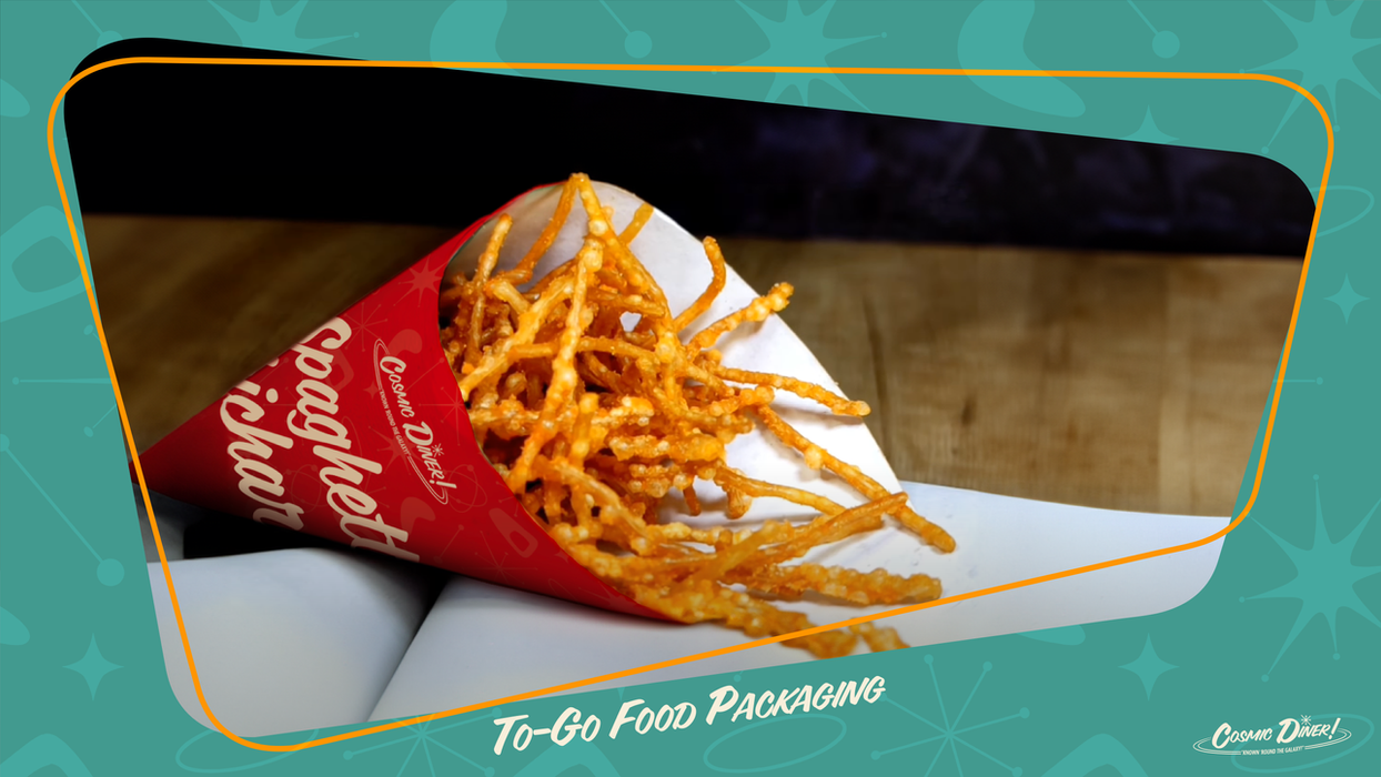
The packaging was created to be simple because the look of the food inside should be a surprise. However, even though it may look unexpected, it still has a classic, nostalgic and familiar taste.
The advertisements were meant to retain customers by reminding them of their favorites or acquiring them by reeling them in with something new. The apron, business cards and point-of- sale machine designs continue the theming throughout the diner's entire experience.


How We Got Here
With every project, the process is always the most important part. The successes, failures, twists and turns are all important learning lessons that make a project the best it can be.
With this project, I made sure to put a lot of time into researching both the aesthetic that I wanted and the form factor of the truck. I cam up with a more techno-leaning space theme, where the truck would have been a crashed UFO, but ultimately it didn't "land" as well as the final concept that I continued with.
bottom of page


